Photogenic 101: The best (& worst) colours to wear in photos this party season
Solid colours or patterns; deep tones or pastel shades?
If you’ve ever been excited to wear an outfit, only to be thoroughly disappointed by how washed-out or unflattering it makes you look in pictures, it might be because you’re wearing a shade that is simply not that photogenic.
With the festive season drawing near, you can safely assume that you’ll be whipping out your smartphones to snap and document every minute of your family get-togethers. And if you want to look good in your holiday family pictures, you may want to take pointers on what colours look best (and worst) in photos.
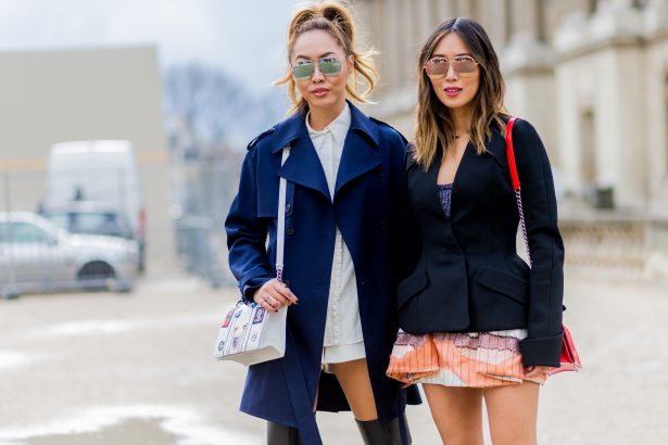
And who better to guide us us than Lee Eiseman, the executive director at Pantone Colour Institute? Here are some key pointers, according to Eiseman: “Solid colours are always best, as opposed to patterns. Very pale pastels and whites can make the subject looked washed-out,” she shares.
It turns out, the makeup you wear can really amp up your outfit too. “(Using) colour in makeup can help considerably, especially professional makeup application.” And if you’re deciding on whether to opt for a solid piece or separates, consider this: “Cameras sometimes have difficulty adjusting between bright contrasts, so it’s best to keep bright (colours) as solid pieces as opposed to separates.”
So what colours should you wear? Browse the gallery above to find out the most photogenic colours you can opt to wear this party season!
Sarah Khan
Photos: Getty Images
Read More:
Get your kids party-ready with Seed Heritage’s Christmas collection
9 Festive maternity style ideas for your Christmas & NYE parties